Popular neutral paint colors create a versatile and inviting atmosphere in any home, setting the perfect backdrop for personal expression through decor. These shades not only promote serenity but also adapt seamlessly to various design styles, making them the go-to choice for homeowners and designers alike.
In this article, we will explore the trending neutral paint colors, their psychological effects, and tips on selecting the perfect shade for different rooms. From kitchens to outdoor spaces, discover how these hues can enhance your home’s aesthetic and functionality.
Popular Neutral Paint Colors
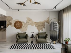
In the realm of interior design, neutral paint colors have become a staple for creating versatile and inviting spaces. These colors serve as a foundation for various decor styles, allowing homeowners to infuse their personal touch without overwhelming the senses. Popular neutral shades provide a backdrop that can enhance other colors and textures throughout the home, making them a go-to choice for many designers and homeowners alike.Currently trending neutral paint colors include shades like warm greys, soft beiges, and cool taupes.
Warm greys, such as Benjamin Moore’s “Stonington Grey,” exude a cozy yet modern feel, making them ideal for living areas and bedrooms. Soft beiges, like Sherwin-Williams’ “Accessible Beige,” offer a welcoming ambiance, perfect for kitchens and dining rooms. Cool taupes, such as Farrow & Ball’s “Elephant’s Breath,” bring a sophisticated touch that works beautifully in bathrooms and entryways. Each of these shades reflects the ongoing trend of creating serene environments that promote relaxation and comfort.
Psychological Effects of Neutral Colors
Neutral colors have a significant impact on the mood and overall atmosphere of a home. They provide a calming effect, often evoking feelings of tranquility and peace. For instance, soft beige tones can create a warm and inviting environment that encourages social interaction, while cool greys can enhance focus and clarity, making them suitable for workspaces.The choice of neutral shades can also influence perceptions of space.
Lighter neutrals often make rooms feel larger and more open, which is especially beneficial in smaller areas. In contrast, deeper neutral tones can create a sense of intimacy and coziness, ideal for bedrooms or reading nooks. These psychological effects contribute to the overall functionality and comfort of a living space, affecting how residents interact with their surroundings.
Tips for Choosing the Right Neutral Paint Shade
Selecting the perfect neutral paint color involves considering various factors, including room size, lighting, and desired mood. Here are some effective tips for making the right choice for different spaces within a home.Firstly, assess the natural light in each room. Rooms with ample sunlight can accommodate darker neutral shades without feeling oppressive, while darker areas may benefit from lighter tones to brighten the space.
For example, a well-lit living room can handle a rich taupe color, whereas a dimly lit hallway might look best in a soft ivory.Secondly, consider the existing furnishings and decor. Choose a neutral shade that complements your furniture and accessories. A cohesive look can be achieved by matching the undertones of the paint with the hues present in rugs, curtains, and upholstery.
For instance, if your furniture has warm undertones, opting for a warm beige will create harmony throughout the space.Lastly, test samples on your walls before committing. Paint can appear differently under various lighting conditions, so it’s essential to see how it interacts with your specific environment throughout the day. A swatch that looks perfect in the store may not have the same effect in your home.
“Choosing the right neutral shade can transform the feel of a room and create a cohesive design scheme.”
Interior Design and Decorating
Neutral paint colors are the unsung heroes of interior design, providing a versatile backdrop that allows various styles to shine. They create a serene environment while accommodating a wide range of design themes—from modern to traditional and minimalist. By incorporating neutral shades, you can achieve a balanced aesthetic that enhances the overall ambiance of your home.Neutral paint serves as a blank slate that complements different interior design styles.
For modern designs, cool grays and soft whites can create a sleek, sophisticated look. In contrast, warmer neutrals like beige and taupe work beautifully in traditional settings, offering a sense of timelessness. The minimalist approach thrives on simplicity, where light, airy neutrals can make spaces feel open and uncluttered.
Incorporating Neutral Colors into Home Décor
The integration of neutral paint colors extends beyond walls; it influences furniture and textiles, creating a harmonious home environment. Here are effective ways to incorporate these shades into your décor:
- Furniture Selection: Choose furniture pieces in neutral tones to ensure they blend seamlessly with your walls. For instance, a light gray sofa against a soft white wall enhances the feeling of space and tranquility.
- Textiles and Fabrics: Use cushions, throws, and curtains in varying neutral shades to add depth. A cream-colored throw on a beige armchair adds subtle contrast while maintaining the cohesion of the color palette.
- Accent Pieces: Introduce elements like rugs or artwork in complementary neutral colors. A jute rug in natural tones can ground a room and provide texture without overwhelming the space.
- Layering Techniques: Layer different neutral shades and textures to create visual interest. Soft linens, smooth leathers, and woven materials can coexist beautifully, showcasing the versatility of neutrals.
The role of neutral paint colors is pivotal in establishing a cohesive color palette throughout a home. By selecting a few core neutral shades, homeowners can ensure that each room flows into the next without jarring contrasts.
“Neutral colors provide a canvas that highlights architectural features and personal style.”
By maintaining a consistent neutral palette, rooms remain interconnected, enhancing the overall flow of your home’s design. For example, using a light beige in the living room, followed by a slightly darker taupe in the dining area, can create a seamless transition that feels both intentional and inviting. This thoughtful approach to color not only elevates the aesthetic appeal but also maximizes the functionality of each space, making neutral colors a wise choice for any interior design project.
Kitchen Improvements
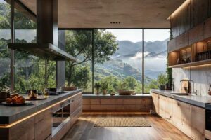
Creating a kitchen space that is both functional and aesthetically pleasing is essential for any home. One of the simplest yet most impactful ways to achieve this is through the use of neutral paint colors. These colors not only enhance the overall design of the kitchen but also promote a sense of calm and balance, making it a welcoming environment for both cooking and socializing.Neutral paint colors can dramatically influence the aesthetic and functionality of kitchen spaces.
By opting for shades such as soft whites, warm grays, or muted beiges, homeowners can create a versatile backdrop that complements various design styles. These colors can make the kitchen feel more spacious and airy, allowing natural light to reflect beautifully throughout the room. Additionally, a neutral palette offers the opportunity to experiment with different textures and materials, resulting in a harmonious blend of elements that enhance both style and usability.
Pairing Neutral Colors with Kitchen Cabinetry and Countertops
When it comes to pairing neutral colors with kitchen cabinetry and countertops, careful consideration can elevate the entire look and feel of the space. The key is to create a cohesive design that balances the various elements without overwhelming the senses.One effective method is to select cabinetry that either matches or complements the chosen neutral paint. For instance, a soft gray wall can beautifully enhance white or dark wood cabinetry, creating a layered look that adds depth to the kitchen.
Countertops also play a crucial role; light-colored quartz or granite can provide an elegant contrast against darker cabinetry, while a natural stone finish can add richness and texture.Here are some ways to successfully pair neutral colors:
- Contrast with Texture: Incorporate textured finishes, like matte or glossy surfaces, to add visual interest while maintaining a neutral color scheme.
- Accent Colors: Use subtle accent colors in decor items or kitchen accessories to break the monotony, while ensuring they harmonize with the neutral palette.
- Consistency in Tone: When selecting paint, cabinetry, and countertops, ensure they are within the same tonal family to create a seamless look.
- Material Variety: Mix materials such as wood, metal, and stone to introduce different elements without overshadowing the neutral tones.
To create an inviting atmosphere in the kitchen, homeowners can employ a range of strategies that utilize neutral colors effectively. Lighting is a critical factor; warm, ambient light can soften the look of neutral walls and cabinetry, making the space feel more welcoming. Additionally, incorporating natural elements such as wooden shelves or plants can introduce warmth and a sense of nature, enhancing the inviting feel.Another technique involves the use of accessories and textiles.
Soft furnishings, such as upholstered bar stools or decorative textiles, can add comfort and style while remaining within the neutral color spectrum. Incorporating these elements allows the kitchen to transition from merely a cooking space to a cozy gathering area.
“Neutral colors can transform your kitchen into a serene and inviting space, perfect for both culinary creativity and social interactions.”
Landscaping and Outdoor Decorating
Incorporating neutral colors into your outdoor spaces can create a serene and cohesive environment that harmonizes with nature. Whether you’re selecting exterior paint for your home or choosing furnishings and features for your landscape, neutral tones provide versatility and elegance. They allow your outdoor area to blend seamlessly with its surroundings while enhancing the overall aesthetic appeal.When it comes to selecting exterior paint, neutral colors like soft beiges, warm greys, and muted whites can be ideal for creating a harmonious outdoor space.
These shades can enhance the architectural features of your home, providing a timeless backdrop that complements natural elements such as trees, flowers, and the sky. Neutral colors are effective at reflecting light, which can brighten up your outdoor areas and highlight landscaping details.
Incorporating Neutral Shades into Landscaping Features
Incorporating neutral hues into your landscaping can elevate your outdoor space and create a soothing atmosphere. Here are some ways to achieve this:
- Planters and Pots: Choose planters in shades of taupe, cream, or soft grey. These colors not only blend well with greenery but also highlight the plants themselves. For example, a light grey pot against vibrant green foliage creates a striking contrast while remaining subtle.
- Outdoor Furniture: Opt for furniture in neutral fabrics such as beige, stone, or light brown. These pieces can seamlessly fit into the landscape, providing comfort without overpowering the natural beauty surrounding them. A sectional sofa in a soft taupe or white can serve as an inviting focal point for outdoor gatherings.
- Hardscaping Features: Incorporate neutral tones in pathways, patios, and walls. Paver stones in shades of grey or beige can unify different areas of your garden, creating a cohesive look. For instance, a sand-colored patio surrounded by lush greenery can create a beachy, relaxing vibe.
- Garden Accents: Use neutral-colored sculptures or garden art to add interest. A white stone fountain can serve as an attractive centerpiece while harmonizing with the colors of the plants around it.
Neutral paint colors can significantly enhance your outdoor design while complementing the natural surroundings. By thoughtfully selecting neutral shades for your landscaping features and outdoor decor, you can create an inviting and balanced outdoor space that feels connected to its environment.
Home Lighting
Understanding how lighting interacts with neutral paint colors is essential for achieving the desired ambiance in your home. The interplay between light and color can dramatically alter the perception of space, so it’s vital to consider how different types of lighting will affect your neutral palette. By selecting the right fixtures and optimizing natural light, you can enhance the beauty and warmth of your rooms, making neutral shades work to their full potential.The appearance of neutral paint colors can vary greatly depending on the type of lighting used in a room.
Warm lighting can make cool-toned neutrals appear softer and more inviting, while cool lighting can brighten warm tones and lend a more contemporary feel. It’s important to assess the lighting options in your space, as the same paint color can evoke different emotions and aesthetics under varied lights.
Impact of Lighting on Neutral Paint
Different types of lighting will influence how neutral paint colors are perceived, thus affecting the overall mood of a room. Here are some key aspects to consider:
- Incandescent Light: This type of light emits a warm glow, which enhances the warmth of beige and taupe paints, making them feel cozy and inviting. This lighting is ideal for living rooms and bedrooms where comfort is a priority.
- Fluorescent Light: Known for its cooler tone, fluorescent lighting can wash out warm neutral colors, making them appear duller. It is generally best avoided in spaces designed for relaxation.
- LED Lighting: LEDs can be found in both warm and cool tones, providing versatility. Warm LEDs make neutrals feel inviting, while cool LEDs can add a modern touch, especially in kitchens and bathrooms.
- Natural Light: Sunlight can dramatically enhance neutral colors, making them appear brighter and more vibrant during the day. North-facing rooms receive cooler light, which can emphasize a blue undertone in certain neutrals, while south-facing rooms bask in warm, golden light.
Selecting Light Fixtures
Choosing the right light fixtures is crucial for enhancing the visual warmth or coolness of neutral tones. Here’s how to ensure your lighting complements your paint choices:
- Choose Bulb Temperature: Aim for bulbs with a color temperature of 2700K to 3000K for a warm ambiance. For a cooler, more modern look, opt for bulbs above 4000K.
- Layer Your Lighting: Incorporate a mix of ambient, task, and accent lighting to create depth and interest. This layering technique allows different areas of a room to shine, showcasing the neutral tones effectively.
- Fixture Styles: Select fixtures that align with the room’s style. For a cozy feel, consider warm metals like brass or copper. For a more contemporary look, sleek, chrome fixtures can complement cooler neutrals.
Importance of Natural Light
Natural light significantly influences how neutral paint is perceived in a room. Window placement and the amount of sunlight a room receives can alter the overall color scheme.
- Window Orientation: North-facing windows provide cool light, which can enhance the coolness of colors like greys, while south-facing windows introduce warm, golden light that can make beiges and creams more vibrant.
- Observation of Changes: The color of neutral paint may look different at various times of the day due to changing natural light conditions. It’s beneficial to observe how your chosen color reacts to sunlight in the room before making a final decision.
- Opt for Sheer Treatments: To maximize natural light while maintaining privacy, consider sheer curtains or blinds that allow light to filter through without completely blocking it.
New Construction
Choosing neutral paint colors in new construction projects is a crucial decision that can fundamentally shape the atmosphere and appeal of a new home. Neutrals serve as a blank canvas, allowing homeowners to express their style through furnishings and decor without clashing with vibrant wall colors. Furthermore, neutral shades add a timeless quality to spaces, making them more appealing to a broader audience, which is particularly beneficial when considering future resale value.In new construction, coordinating neutral colors with other construction elements, such as flooring and cabinetry, can enhance the overall aesthetic harmony of the home.
When selecting a neutral palette, it’s essential to consider the undertones of the chosen colors to ensure all elements complement one another. For instance, if opting for a warm beige on the walls, pairing it with a honey-toned hardwood floor and cream-colored cabinetry can produce a warm and inviting atmosphere.
Strategies for Coordinating Colors
To effectively coordinate neutral colors throughout a new construction project, consider the following strategies:
Assess the Natural Lighting
Evaluate how natural light interacts with different colors at various times of the day. This understanding can guide the choice of shades that will look best in specific rooms.
Create a Color Flow
Use a consistent color palette throughout the home to create a cohesive look. This can involve selecting one or two primary neutral colors and using variations of these shades in different areas.
Consider Architectural Features
Pay attention to features such as crown molding, door frames, and baseboards. The color of these elements should either match or complement the wall colors for a seamless transition.
Incorporate Textures
Use various textures in your materials, such as matte finishes for walls and glossy finishes for cabinetry, to add depth and interest without introducing too much color.
Use Sample Boards
Create sample boards that include paint swatches, flooring samples, and cabinetry finishes to visualize how the colors work together before making final decisions.
Trends in Neutral Color Schemes
Neutral color schemes for newly built homes are evolving, with several emerging trends shaping the industry. Current trends can include:
Greige Shades
This blend of gray and beige offers warmth while maintaining a modern edge, making it a popular choice for contemporary homes.
Soft Whites and Off-Whites
These hues provide a clean and airy feel while allowing homeowners to add colorful accents through decor and furnishings.
Cool Undertones
Colors like icy blues and soft greens are gaining popularity as neutrals, offering a fresh alternative to traditional warm tones.
Dark Neutrals
Deep shades such as charcoal or navy are being used more frequently as statement colors, especially in areas like kitchens and dining rooms, providing dramatic contrast to lighter elements.
Textured Neutrals
Using paint with a texture or a matte finish can add character to a space without overwhelming the senses.By thoughtfully selecting and coordinating neutral paint colors in new construction, homeowners can create spaces that are not only visually appealing but also adaptable to changing styles and preferences over time.
Home Painting
:max_bytes(150000):strip_icc()/gray_cashmere-56a192a93df78cf7726c1c0d.png?w=700)
Selecting the right neutral paint finish is essential for achieving a polished look in your home. It not only enhances the aesthetics but also contributes to the durability of the surfaces you are painting. Understanding the different finishes available for various surfaces can help you make informed decisions that suit your style and functionality needs.When preparing walls for painting with neutral colors, it’s important to create a clean and smooth surface.
This preparation can significantly affect the outcome of your paint job, ensuring that the colors look vibrant and last longer. Here are the key steps involved in preparing your walls effectively:
Preparing Walls for Painting
Before you start painting, ensure your walls are in optimal condition to achieve the best results. The following steps will guide you through the preparation process:
Clean the Walls
- Dust, dirt, and grease can prevent paint from adhering properly. Use a mild detergent solution to wipe down the walls, followed by rinsing with clean water and allowing them to dry completely.
- Repair Damages
- Inspect the walls for any cracks, holes, or imperfections. Use spackle or joint compound to fill these gaps, and sand the area smooth once dry. This will create a uniform surface for painting.
- Prime the Surface
- If you’re painting over a darker color or a surface that has never been painted, applying a primer will help the neutral paint color adhere better and ensure even coverage.
- Tape Off Edges
- Use painter’s tape to mask off trim, windows, and door frames. This helps create clean lines and prevents paint from getting onto surfaces you don’t want to be painted.
- Choose the Right Finish
Depending on the surface, you might want to select different finishes, such as matte for ceilings, eggshell for living rooms, or semi-gloss for kitchens and bathrooms. Each finish has its own level of durability and sheen that can enhance the overall look.The benefits of using neutral paint colors extend beyond aesthetics; they can also play a crucial role in maintaining a home’s resale value.
Neutral tones are often favored by potential buyers for their versatility and the sense of spaciousness they create. A well-painted neutral room can appeal to a broader audience, making it easier for buyers to envision their own style in the space.
Benefits of Neutral Paint for Resale Value
When considering the impact of neutral paint on resale value, several key advantages come into play:
Wide Appeal
- Neutral colors provide a blank canvas that allows potential buyers to imagine their personal touch without the distraction of bold hues.
- Perceived Space
- Lighter neutral shades can make a room feel larger and airier, which is often a desirable trait in home buying.
- Timelessness
- Trends in design come and go, but neutral colors tend to remain timeless. Choosing neutral palettes can make your home feel updated without falling victim to fleeting color trends.
- Easy Coordination
Neutral colors easily coordinate with various furnishings and décor styles. This adaptability can entice buyers who may have different tastes.By keeping these factors in mind during the home painting process, you can ensure a successful project that enhances both the beauty of your space and its potential resale value.
Patio Deck
Creating a harmonious connection between indoor and outdoor spaces is essential for a well-designed home. Neutral paint colors play a pivotal role in achieving this seamless transition. When applied to patio decks, these colors not only enhance the aesthetic appeal but also contribute to a calming environment that encourages relaxation and entertaining.Neutral paint colors, such as soft grays, beige, and taupe, can effectively unify the décor of both indoor and outdoor areas.
By painting your patio deck in these tones, you create a visually appealing extension of your living space, making it feel like a natural continuation of your home’s interior. For instance, pairing a light gray deck with white or cream walls can frame the outdoor area beautifully, while darker neutral shades can add depth and sophistication.
Outdoor Furniture Finishes
Choosing outdoor furniture that complements neutral-painted surfaces enhances the cohesive look of your patio. Various finishes can harmonize beautifully with a neutral palette. Here are some examples:
- Natural Wood Finishes: Furniture made from teak or eucalyptus with a clear coat finish has warm undertones that harmonize with neutral decks.
- Powder-Coated Metal: Furniture in muted colors like sage green or soft charcoal adds a modern touch while maintaining a subtle appearance against neutral surfaces.
- Woven Textiles: Outdoor cushions and pillows in soft pastels or earth tones provide comfort and visual interest without overwhelming the space.
- Concrete or Stone Accents: Tables and planters made from these materials can create a sleek, contemporary look that pairs well with neutral shades.
These finishes not only look great but also withstand outdoor conditions, contributing to the longevity and appeal of your patio decor.
Maintenance Tips for Neutral-Painted Decks
To keep your neutral-painted patio deck looking fresh and inviting, regular maintenance is crucial. Here are some essential tips to ensure the longevity of your paint and the overall appearance of your deck:
- Regular Cleaning: Sweep the deck regularly to remove debris and dirt. Use a mild soap solution to wash the surface every few months to prevent stains and discoloration.
- Inspect and Touch Up: Check for any chips or scratches in the paint. Touching up these areas promptly will help maintain a polished appearance.
- Sealant Application: Every few years, apply a clear sealant to protect the paint from moisture and UV damage, which can fade colors over time.
- Seasonal Maintenance: During harsh weather, cover furniture and use protective mats to prevent wear and tear on painted surfaces.
By implementing these simple maintenance strategies, you can ensure that your neutral-painted patio deck remains a beautiful and functional space for years to come.
Pest Control
Neutral paint colors do more than just beautify a space; they can also play a significant role in pest control. The impact of color on pest behavior is an interesting aspect of home maintenance that often goes unnoticed. In particular, neutral shades can create environments that are less inviting to various pests, contributing to a more comfortable living space.When it comes to pest prevention, the choice of colors in pest-prone areas can be crucial.
Neutral colors, such as soft whites, beiges, and grays, help maintain a clean and less cluttered appearance, making it easier to spot any potential infestations. These tones can also contribute to a sense of openness and tranquility, which can reduce stress about the possibility of pest issues. Choosing the right colors for these areas not only enhances aesthetics but also serves a practical purpose in pest management.
Choosing Colors for Pest-Prone Areas
In pest-prone areas, the selection of neutral colors can be particularly effective. The following insights can help you utilize colors strategically:
- Light Shades: Using light neutral shades can make it easier to notice signs of pest activity, such as droppings or webs.
- Minimalist Approach: A minimalist design with neutral colors can reduce clutter, making it harder for pests to find hiding places.
- Reflective Properties: Lighter hues can reflect more light, creating an uninviting atmosphere for pests that prefer darker spaces.
Using Neutral Colors Outdoors to Deter Pests
In outdoor areas, neutral colors can also deter pests while maintaining curb appeal. A thoughtfully chosen color palette not only enhances the beauty of your garden or patio but can also impact pest behavior. Here are some tips to consider:
- Natural Integration: Using neutral tones that blend with the surrounding landscape can reduce the likelihood of attracting pests that are drawn to vibrant colors.
- Avoiding Bright Contrasts: Bright colors can attract certain insects; opting for neutral shades can minimize this risk.
- Consistent Color Schemes: A cohesive color scheme across outdoor furniture and decor can create an aesthetically pleasing environment that’s less inviting to pests.
“When designing pest-prone areas, consider that a well-thought-out color palette can enhance both aesthetics and practicality.”
Home Plumbing
In the realm of home improvement, plumbing is one of the essential areas that often requires a careful blend of functionality and aesthetics. Utilizing neutral paint colors in bathrooms can significantly enhance the overall atmosphere, creating a calming and polished look that harmonizes beautifully with plumbing fixtures. Neutral hues serve as a versatile backdrop, allowing the design elements of your bathroom to shine while also providing a sense of tranquility in a space that often needs to feel serene.
Incorporating neutral colors into plumbing renovations or updates not only elevates the visual appeal but also ensures that the space remains timeless, minimizing the risk of it becoming outdated quickly. Neutral colors can also enhance the perceived cleanliness of a bathroom, an essential aspect given the frequent maintenance associated with plumbing activities. Here are some design ideas that illustrate how neutral tones can be effectively woven into plumbing projects.
Design Ideas for Incorporating Neutral Colors in Plumbing Renovations
Utilizing neutral colors in plumbing renovations can dramatically transform the look and feel of your bathroom. Here are some effective strategies to consider:
1. Soft Whites and Beiges
Using soft white or beige paint can make your bathroom feel more spacious and light. These colors work well with a variety of plumbing fixtures, such as chrome faucets and ceramic sinks, emphasizing their elegance.
2. Greys for a Modern Touch
Shades of grey can provide a contemporary edge to your plumbing fixtures. Pairing a light grey wall with darker grey tiles creates a sophisticated contrast that highlights the plumbing design while maintaining a clean aesthetic.
3. Accent Colors with Neutrals
Introduce a neutral base and add subtle accent colors, like sage green or soft blue, through decorative items or plumbing fixtures. This approach allows you to keep the overall look elegant while adding a hint of personality.
4. Matte and Glossy Finishes
Consider using paint finishes that complement each other, such as matte walls paired with glossy plumbing fixtures. This combination can create a visually striking effect while maintaining a cohesive neutral palette.
5. Textured Walls
Experimenting with textured wall finishes in neutral tones can add depth to your bathroom design. Textured paint or paneling can enhance the appearance of plumbing fixtures, making them stand out without overwhelming the space.
Neutral paint colors offer significant benefits in areas that require frequent cleaning, especially in relation to plumbing activities. Maintaining a clean and organized bathroom is vital, and neutral colors can help in several ways. They effectively mask minor stains and watermarks, which are common in spaces where plumbing is prevalent, allowing for a more polished look with less frequent repainting.
Additionally, lighter shades help reflect light, making the space feel airy and bright, which is particularly beneficial when dealing with small or windowless bathrooms. By choosing neutrals, homeowners can create a cohesive environment that supports the functionality of plumbing while enhancing the overall decor of the bathroom.
Home Remodeling

Neutral paint colors play a vital role in home remodeling projects, offering versatility and broad appeal that can significantly enhance the overall aesthetics of a space. These colors provide a backdrop that allows homeowners to experiment with various design elements while ensuring a cohesive look throughout the home. When done thoughtfully, a neutral color palette can transform a remodeling endeavor into a timeless masterpiece that can adapt to changing styles and preferences.In successful remodeling projects, neutral colors have been utilized effectively to create harmonious environments.
For example, a recent kitchen remodel in a suburban home embraced a palette of soft greys and warm beiges. This choice not only modernized the space but also blended seamlessly with the sleek stainless-steel appliances and bold granite countertops, allowing each element to stand out without clashing. Similarly, a bathroom remodel featuring crisp white walls with hints of taupe provided a serene backdrop for vibrant accessories like colorful towels and artwork, illustrating how neutral shades can elevate the overall design.
Balancing Bold Design Elements
Neutral colors excel at balancing bold design features, ensuring that statement pieces can shine without overwhelming the space. By using a neutral backdrop, homeowners can confidently incorporate vibrant furniture, striking light fixtures, and colorful decor without creating visual chaos. This strategy not only enhances the overall design but also allows for easy updates as trends change.An example of this can be seen in a living room remodel where a deep navy blue sectional was the focal point.
The walls were painted a soft alabaster, which created a clean and inviting atmosphere. To further accentuate this balance, the space featured bold artwork and vibrant throw pillows, all while maintaining a cohesive and stylish look. This approach underscores the effectiveness of neutral colors in home remodeling, providing a foundation that celebrates both boldness and elegance.
Neutral colors serve as the perfect canvas, allowing bold design choices to flourish while maintaining a sense of harmony and balance.
Concluding Remarks
In conclusion, embracing popular neutral paint colors can dramatically transform your living spaces, contributing to both style and comfort. Whether you’re renovating, decorating, or just looking to refresh your home’s look, these shades offer endless possibilities for creating a harmonious environment that reflects your personality.
Query Resolution
What are popular neutral paint colors?
Popular neutral paint colors include shades like beige, gray, taupe, and off-white, which provide a versatile backdrop for various design styles.
How can neutral colors affect mood?
Neutral colors are known to create a calming effect, promoting relaxation and tranquility in home environments.
Which neutral color is best for small spaces?
Light shades like soft beige or pale gray are ideal for small spaces as they create an illusion of openness and brightness.
Can I use neutral colors in outdoor spaces?
Absolutely! Neutral colors can enhance outdoor areas by providing a cohesive look that complements natural surroundings.
What finish should I choose for neutral paint?
Choosing a satin or eggshell finish for neutral paint can help reflect light while being durable for different surfaces.